UI & UX Design
Ultimate Guide to Colour Theory, Psychology and UI

Colour is everywhere, but you might not realise how much of an influence colour has in the decisions you make, the information you absorb and the emotions you experience.
From understanding colours and knowing when to use them, your ability to design and brand will improve dramatically. Let's find out.
Basics of colour and the colour wheel
Firstly, understanding the basics of colour and colour theory will help your judgement in choosing what colours to put together and which combinations to definitely avoid.
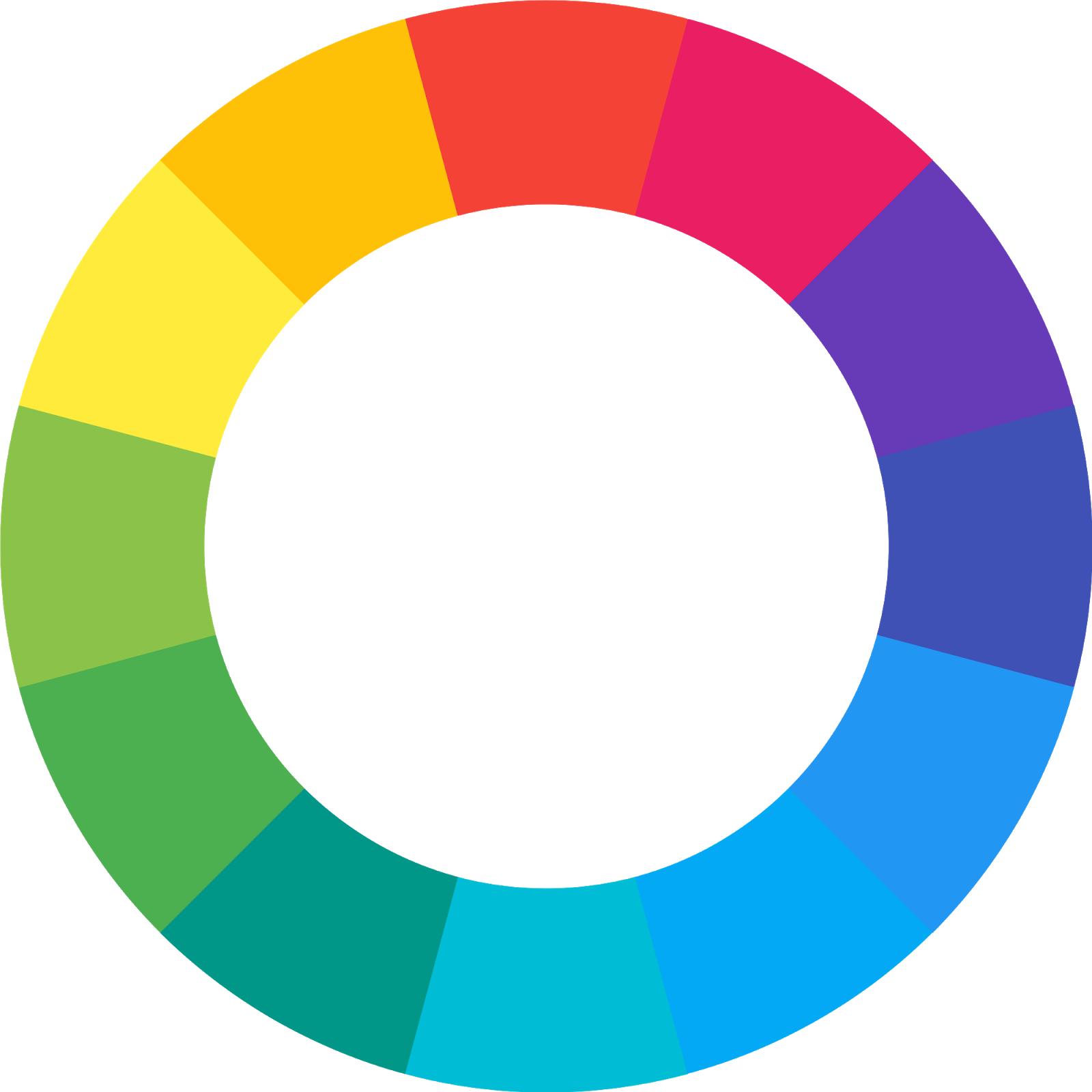
Let’s start with the foundation colours of the colour wheel – Primary colours.
Primary colours consist of three colours – Red, Blue and Yellow. These primary colours are mixed together to form secondary colours – Orange, Purple and Green. Together, they form the basic colour wheel.
Primary colours and secondary colours are mixed together to create six tertiary colours, which include blue-green, red-purple, etc.
Colours can also be referred to as hue. Hues can then be altered with saturation, value, tint and tone. Saturation refers to the intensity of the hue, changing how vibrant or subtle the hue is. Value is the relative darkness or lightness of the hue. Tint is a hue to which white is added.
Tone alters a hue by adding grey. Colours can be then be sub-categorised into warm colours and cool colours. This is generally separated by drawing a line down the center of a colour wheel. Warm colours are generally associated with brightness, action and energy, whilst cool colours are often used for calm, peace and serenity.
Colour harmony
Now that you’ve got the basics of colour down, let’s move to actual formulas that have been tried and tested to help you select colour combinations.
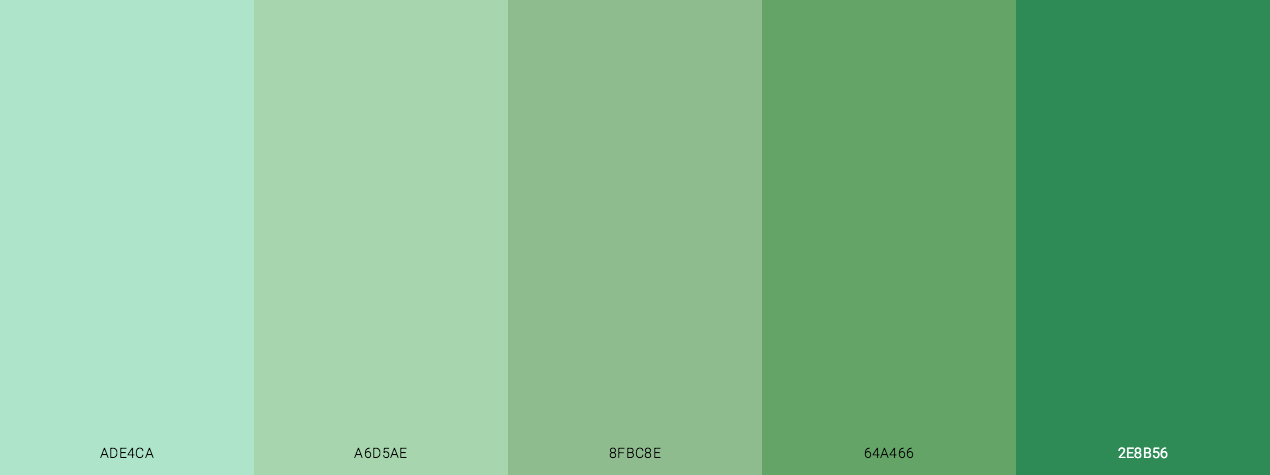
1. Monochromatic
This is the easiest formula and only consists of one colour. Using one colour may seem boring, but playing with saturation, value, tint and tone can produce colour combinations that harmonise with one another and they’re guaranteed to match.
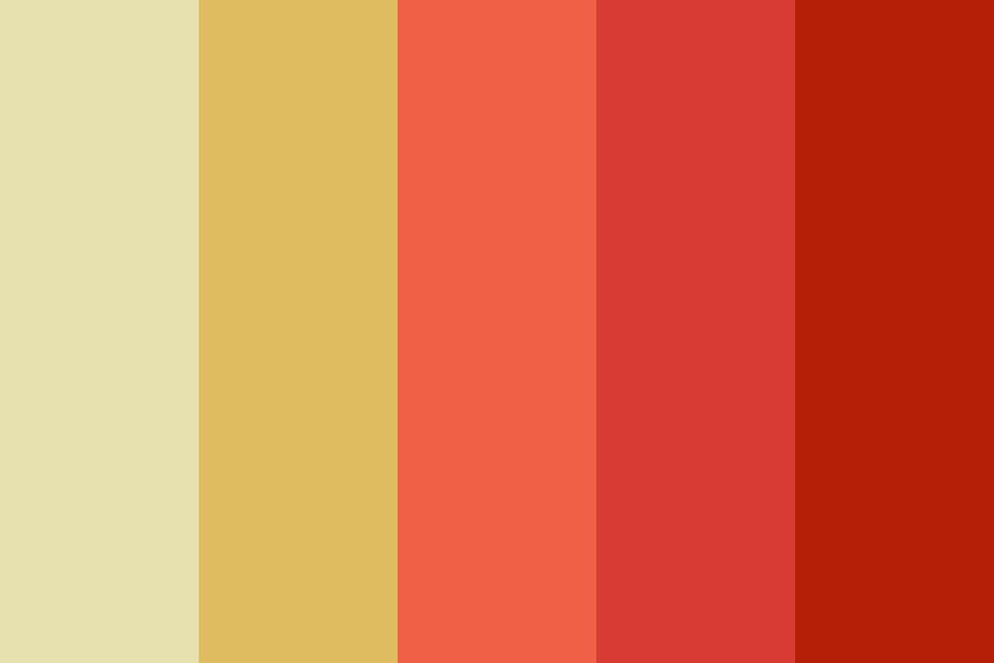
2. Analogous
Analogous colours sit next to each other on the wheel. You will find that by using analogous colours, there will always be one colour that dominates, one that accents and one that supports. They can help with creating a visual direction or visual hierarchy for your viewer.
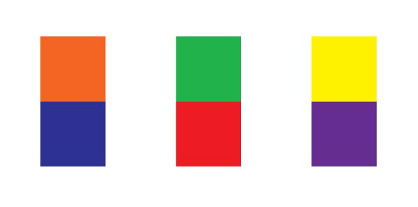
3. Complementary
Complementary colours are opposite each other on the wheel. When combined, the drastic contrast between these colours can help them stand out and make an imagery pop. Complementary colours are perfect for when you want to create a clear distinction between two objects.
4. Split complementary
Split complementary colours use colours on either side of the complement. They give the same level of contrast as complementary colours but gives you the option of working with more colours.

5. Triadic
Triadic colours are three colours that are evenly spaced on the colour wheel. They tend to be striking and dynamic. When used well, triadic colours can provide a visually pleasing contrast and harmonic aesthetic.

6. Tetradic
Tetradic colours are four-colour combination which form a rectangle on the colour wheel. There is a strong, vibrant contrast between the four colours. Therefore, when using tetradic colours, be mindful of how you use them in your approach. Tetradic colours can work well if you let one colour dominate and use the others as accents.

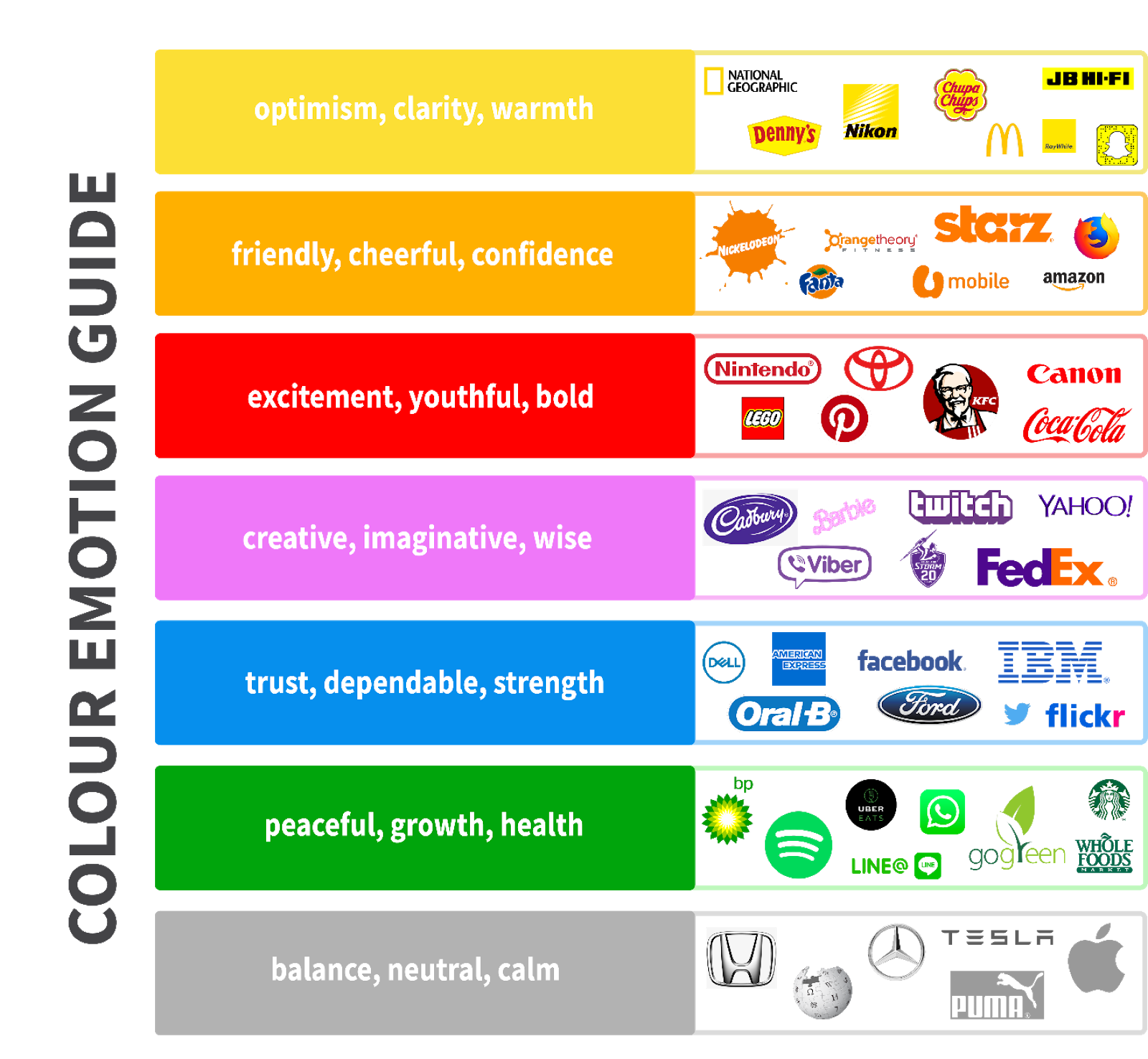
Colour psychology
Now, let’s talk colour psychology and the emotional ‘baggage’ that each colour comes with!
Colour psychology is the study of colours in relation to human behaviour. It aims to study and determine how colour affects our day-to-day behaviour. Understanding the psychology of colour can help you establish your brand identity, drive sales and maybe even tell people what to do.
Before we start generalising the psychology of colour, we have to be aware that personal experience and cultural differences can affect an individual’s perception of colour. Therefore, when applying colour, the context in which you use certain colours cannot always rely on the generalised colour psychology guide.
5 tips for using colour in UI
Can you read it?
A basic standard and yet, legibility and accessibility are still mistakes that designers make. Make sure the colours that you use provide minimum strain on the eyes and is simply readable, specially for someone with reading difficulties.
Also, don’t forget about designing for dark mode! Neutral colours are your friend – black, white, grey. They help your colours stand out and they’re always a great backup, if nothing is feeling right.
Interior design hacks: 60-30-10 rule
Use the 60%-30%-10% proportion to give balance to your colours. The 60% is for your dominant hue, your secondary colour is 30% and your accent colour is 10%. This formula creates a sense of balance between the colours and is simple to use.
Mother nature: natural inspiration
When in doubt, look around! Use nature as your inspiration because it’ll always look natural and somehow always aesthetic. Mother nature, you’re a beaut!
Chat to us
If you’d like to work on fresh, inspiring projects with us in the future, or if you’re keen to join an agency that values continued growth, forward-thinking and innovative behaviours, reach out to our friendly team at Exo Digital!
Book an Info Session
Feeling inspired? Take the first step and book in an info session with one of our team